5 Companies With Terrible Career Pages
Anyone else see think Maev’s employer branding gets a little lost? ( Photo: Maev)
Lots of businesses get their customer-facing brand right, but let their candidate-facing brand wither on the vine.
We’ll survey five companies whose candidate-facing experience falls flat. They all have a few things in common.
1. Weak visuals, as in, no video
Ninety percent of consumers say video helps them make buying decisions. Your consumers are top talent, and you want top talent to buy your employer brand.
And if you’re already using video to market to customers (86% of brands are), why aren’t you using video to market to candidates?
2. Boring information (or no information at all)
What company doesn’t tout itself as “innovative” and “forward thinking”? You’ve gotta show job seekers what you have to offer.
And psst: Your page has to be more robust than a vague spiel on company values and a five-point checklist of benefits.
3. An inconsistent experience between customer-facing brand and client-facing brand
This is the big one. So many companies understand how important a strong customer-brand is, but they haven’t invested in their employer brand. Candidates will notice, and may get the sense that you just don’t care.
Note to ghost kitchens: use your Career page to be transparent (Photo: Zuul)
Zuul
Food delivery tech company Zuul gets the visual experience on their site so right—bold colors, beautiful photos, on-trend design—but its careers page just doesn’t get us excited about working there.
Information about the company as an employer is sparse, and there’s only one image, a static image at that. You know how a picture is worth a thousand words? Well imagine how many words a video is worth (hard to calculate exactly, but it’s high).
They’re also missing out on one-upping competitor GrubHub, whose careers page features both video and detailed information about benefits and perks.
Vouch
Look, we know it’s tough to get people excited about working in insurance, but if anyone could entice the next wave of insurance pros, it’s Vouch. Only they’re missing the opportunity with their impersonal careers page.
Vouch boasts what’s easily the most beautiful site in insurance, but we’re getting nothing from the careers page. The employee quotes are vague, generic. Flat.
And don’t get us wrong, the illustration of the fist bump is great, but does it make us want to work there? Eh.
Etsy keeps commerce human, so why do they recruit candidates using a robotic approach? (Photo: Etsy)
Etsy
Etsy’s own mission is Keep commerce human, but their careers page does anything but. It lacks that spark, that warmth the brand is known for. This is a perfect example of inconsistency between customer and candidate-facing brands.
And let’s take a moment to note an oh-so-common but oh-so-lazy employer branding mistake: a list of award badges that tout the company as an employer. The adage show, don’t tell applies.
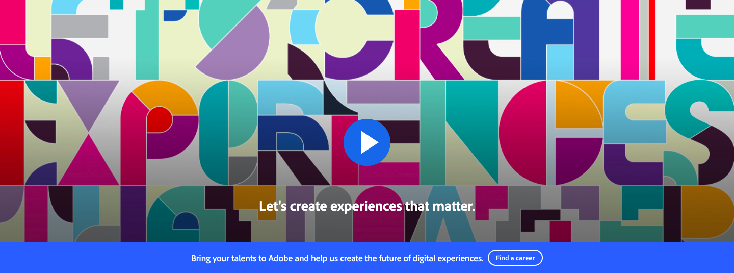
Click through the banner (we won’t blame you for scrolling past) and you’ll find…disappointment (Photo: Adobe)
Adobe
We’re pretty shocked by how disappointing Adobe’s careers page is. Adobe builds the best and most sophisticated products for creatives, and yet their careers page just isn’t...creative.
And it tells us N.O.T.H.I.N.G. about working for Adobe—the most creative company on planet Earth.
And we had so much hope. A video on the page! Above the fold! But it’s a product video, not an employer branding video, so why does it banner their careers page? No, seriously. Why?
Maev is ready to sell you on anything…except why you should actually work there (Photo: Maev)
Maev
Ultra-cool dog food brand Maev is working with such a strong brand—it’s highly visual, mission rich, and dog forward. But their employer branding efforts are nonexistent.
Maev’s careers page has two only elements for someone who is actually there looking for a job: a list of company values and a list of open positions. *Crickets chirping*
There’s also a ton of distractions that might make you forget you’re there to apply for a job, as well as a line about looking for candidates who are interested getting their hands dirty trying something new. Good thing Maev has access to dog food, because they’ll need to eat some of their own in order to really capture the talent they desire.
Emily McCrary-Ruiz-Esparza writes about workplace culture, DEI, and hiring. Her work has appeared in Fast Company, From Day One, and InHerSight, among others.
ABOUT UNCUBED STUDIOS
Launched in 2016, Uncubed Studios is a full-service creative agency with a client list representing the most influential employers on earth along with the high growth tech companies.
The team that brings the work of Uncubed Studios to life is made up of award-winning experts in cinematography, journalism, production, recruitment, employee engagement, employer branding and more.
Uncubed Studios is part of the Uncubed Group, which also includes Mediabistro, the leading talent & professional community in the media sector, and Finalist, the curated sourcing platform for early professional tech talent.
Interested in speaking with Uncubed Studios for a media opportunity? Contact studios@uncubed.com


