Uncubed (Somewhat) Approved: Breeze’s Careers Page
A careers page is one of the foundational elements of an employer brand. Prospective hires won’t necessarily discover you this way—they’re more likely to find you through a job board or a friend, for example—but those interested in working for your company will come looking for more information on who you are as an employer.
Your careers page should be carefully planned to convey tone and detail, and simple enough to get prospective hires moving through your talent funnel quickly.
In this edition of Uncubed Approved, we’ll look at the careers page of Breeze, an insurtech (that’s insurance tech) company that sells products like disability insurance directly to consumers.
Before we begin, let’s quickly review the six things a careers page should accomplish:
Establish the employer brand tone
Link the candidate-facing and consumer-facing brands
Introduce candidates to current employees
Provide basic information on things like values, benefits, and comp
Point visitors to open positions and make it easy to apply
Balance color, text, images, icons, and video
Meeting these criteria doesn’t guarantee a successful page. You can tick all six of these boxes and still fail to create a page that delivers. In this article, we’ll talk about how to avoid tiny mistakes that can bring your page down.
Breeze’s careers page
Breeze’s careers page is easily accessed through its home page, in the top nav and in the site footer. Notice the yellow We’re hiring! flag. If I were a potential hire, this would be very encouraging to me, so let’s keep moving.
Above the fold there are three strong elements: a mission statement, a CTA to view job openings/apply, and real, friendly faces. Given their T-shirts, I think we’re meant to believe these are real Breeze employees. The tone (helpful, approachable) and colors also match those of the consumer-facing brand. Note also the additional NOW HIRING - A LOT flag.
Below this is a carousel that includes employee testimonials (some of which help further clarify what the company does), news about a new round of funding, and company achievements. This helps us get a sense of what the company values: its workers, company growth, and industry recognition.
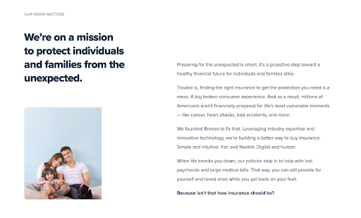
The next section elaborates on the banner mission statement—to solve some of the biggest problems in insurance.
Following this is a list of company benefits and perks, like remote-friendly working, unlimited vacation, and 401(k) matching. It nicely balances text, icons, and negative space.
So far, so good! I’m getting excited to apply! I hope they have something for me!
It all takes a dark turn
Throughout the page, we’re told the company is hiring, that they have open jobs, and we get the sense that they want us to apply—there are several calls to action to view open positions, they introduce us to potential colleagues, and they let us know that the company is growing. I feel like they really want me!
But at the time of this writing, the only “position” available at Breeze is a general application to join its talent community. This is the only destination of all those CTAs. In other words, a dark hole where resumes go to be crushed in a vacuum. This is the virtual equivalent of we’ll keep your resume on file.
Note also that the Breeze talent community is in Omaha, Nebraska. What happened to the remote-friendly work environment?
Inside, it doesn’t get any better. It’s company boilerplate, plus this line: Thank you for your interest in Breeze. If you can’t see a position which fits your skill set, don’t wait - register with your information through this listing and we will be in touch once something opens up!
Wait, once something opens up? What was all this talk about “HIRING - A LOT”?
As a potential candidate, I feel misled, and I’m ready to bail. At best, the confusion on the page makes the company look disorganized and slow. At worst, it makes the company look dishonest.
But I’m not a pessimist, and I believe this is just an innocent mistake on Breeze’s part. Their page is thoughtfully built, so I can only chalk it up to a hiccup in page management. This error is so easily corrected—simply remove the We’re hiring flags and note whether members of the “talent community” are eligible for remote work. Whew, I’m feeling better already.
So, what have we learned here?
Keep your careers page up to date. If that means you need to make it a little less flashy (for example, no fun We’re hiring! flags), that’s OK. Otherwise, make a plan to keep it spanking new.
Don’t promise something you can’t deliver, like a hiring surge when there isn’t one or remote work when it isn’t available to all.
Make sure your job descriptions are specific, even the ones to join a talent pool: What qualities do you look for? What locations? Are there specific skill sets you’re lacking? Don’t expect someone to take the time to prepare a resume and cover letter if you don’t tell them what you’re after.
Emily McCrary-Ruiz-Esparza writes about workplace culture, DEI, and hiring. Her work has appeared in Fast Company, From Day One, and InHerSight, among others.
ABOUT UNCUBED STUDIOS
Launched in 2016, Uncubed Studios is a full-service creative agency with a client list representing the most influential employers on earth along with the high growth tech companies.
The team that brings the work of Uncubed Studios to life is made up of award-winning experts in cinematography, journalism, production, recruitment, employee engagement, employer branding and more.
Interested in speaking with Uncubed Studios? Email us at studios@uncubed.com


