Background Check: Klarna v. Affirm
Background Check: Klarna v. Affirm
The companies that compete for customers are the same ones that compete for talent. Major businesses pour major cash into their customer-facing brands, but do they pay the same attention to their candidate-facing brands?
In the Background Check series, we put the employer brands of two major companies head to head and declare a winner. This week’s competitors: fintech companies Klarna and Affirm. In this particular check, we’ll compare the experience of going to their careers pages.
Both Klarna and Affirm are fintech companies that provide services to online retailers, most popularly, installment loans for consumers at the point of purchase. In other words, payment plans for goods and services.
You probably saw one of these names the last time you shopped online. Something like, $148, or 4 installments of $37.00 with Affirm on a product page.
Basic first impressions
Both Klarna and Affirm are popular companies in a trendy industry. If you’re a worker who likes to float in fintech circles, you may check out both when looking for a job. So, whose employer brand will entice you to apply?
Let’s start with first impressions. Both have easily discoverable careers sites linked in the footer of their consumer-facing sites. When you click, here’s what you see.
Woah. I mean, when you put it like that.
Klarna’s the clear winner of the first-impression test. Their banner is bold—in color and in language—and there are four human faces above the fold. As an employer, it markets itself as a people company, and I’m starting to believe it.
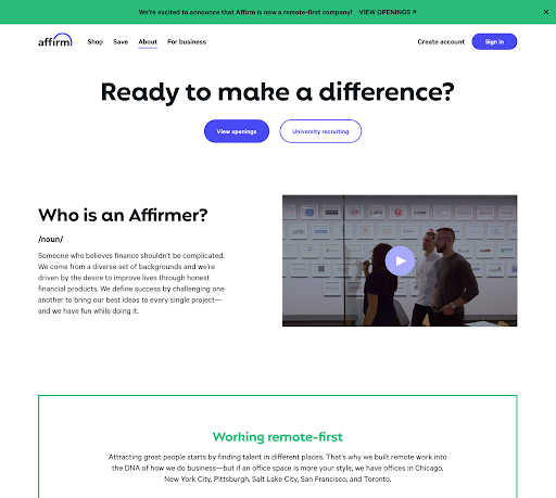
Affirm’s page is, well, white. Next to Klarna’s We don’t have a job for you., Ready to make a difference? feels more like a diffident question than a bold call to action. As an employer, it markets itself as a place where you can make a difference. But a difference in what? There are three humans above the fold on Affirm’s page, but they’re greyed out, only sort of visible, and they don’t look happy.
Let me also draw your attention to the top navigation bar. Klarna has taken us to a microsite dedicated only to the company as an employer. Our culture, locations, competencies, and application process are relevant to candidates, not consumers. Check check. Affirm’s top nav is the same for both consumer- and candidate-facing brands. Not the worst crime, but not ideal either.
Klarna wins the first-impressions competition.
A peek inside the company
If you’re thinking of applying to a company, a peek into company culture and employee experience may just be the push you need to apply. Let’s see how the two companies pull back the curtain.
Klarna goes deep. They have a library of employee profiles that are image-rich and copy-based.
Take note cash-conscious employer marketers: Written employee profiles and interviews can be just as effective as video profiles, at a fraction of the cost.
They also have a fully built-out and regularly updated Life at Klarna blog. If an employer blog is ever within your reach, we highly recommend it. It’s expensive, but the ROI is bananas. Check. Check.
In addition to employee benefits and company values (which, we should note, both Klarna and Affirm have on their pages), Affirm includes something super yummy: a data-driven report on its commitment to diversity, equity, and inclusion (DEI).
This we love. Not only is it responsible to regularly examine company culture and policy, this information is something your applicants care about. Environmental, social, and governance (ESG) issues are increasingly important to the public and can have a major effect on your ability to attract and retain talent. Check.
How many companies have rich materials like this that come out of their ESG plans or investor relation efforts (Affirm, unlike Klarna, is a publicly traded company) that could be repurposed on a careers page or site? Start poking around. You might already have something like this lying around.
Affirm’s inclusion of their DEI report earns them major points, but Klarna just goes the extra mile (or 10) with their library employee profiles and consistently updated blog. Another point for Klarna.
C’mon, we can’t all be Klarna!
We beg to differ.
Klarna is the pretty clear winner here when it comes to employer sites. To be fair, they’ve clearly put a lot of money into their careers site. The experience is rich, engaging, and easy to navigate, and they’ve made it easy for prospective applicants to get a taste of their company culture. (And we didn’t even get to everything we love about the site, like interview tips and competencies.)
But we also don’t believe a strong employer site requires deep pockets. The beautiful thing about the internet is that using colors is free! And if you don’t have the money to produce video content, go with high-quality photos paired with rich copy. If you can’t afford to hire a team to run a company blog, appoint a single content person to assign simple posts to workers throughout your company. And wherever you can, repurpose content, like Affirm did with their DEI report.
Emily McCrary-Ruiz-Esparza writes about workplace culture, DEI, and hiring. Her work has appeared in Fast Company, From Day One, and InHerSight, among others.
ABOUT UNCUBED STUDIOS
Launched in 2016, Uncubed Studios is a full-service creative agency with a client list representing the most influential employers on earth along with the high growth tech companies.
The team that brings the work of Uncubed Studios to life is made up of award-winning experts in cinematography, journalism, production, recruitment, employee engagement, employer branding and more.
Uncubed Studios is part of the Uncubed Group, which also includes Mediabistro, the leading talent & professional community in the media sector, and Finalist, the curated sourcing platform for early professional tech talent.
Interested in speaking with Uncubed Studios for a media opportunity? Contact studios@uncubed.com


