Background Check: Airbnb v. Vrbo
In this edition of Background Check, we’ll look at the career page experiences of two major travel brands: VRBO and Airbnb.
Pack your proverbial bags and let’s go.
First impressions
Both VRBO and Airbnb use microsites. This means that it’s more than a single page with employer info and links to open jobs; the site gets its own subdomain and organizational structure. Microsites are more expensive and require more work and upkeep than single career pages do, but they’re worth the resources. If you want to learn more about the difference between a careers page and a microsite, check out the background check we did between Affirm and Klarna.
Note that VRBO’s careers page is actually Expedia’s careers page.* VRBO is one of twelve brands under the Expedia banner. You’ll recognize others, like Travelocity and CheapTickets. Though it’s clear on page one that VRBO exists under the Expedia umbrella, it’s a little disappointing that I can’t aim my job search specifically at VRBO.
The good news is, Expedia/VRBO banners its page with high-quality travel imagery above the fold. Considering it's a travel brand that employs people all over the planet, this is great.
Airbnb’s above-the-fold sends mixed signals. We get a picture of a (beautiful) office space, with the question, What’s your next destination? But my question is: If I work for Aibnb, do I have to work in an office? Sixty percent of onsite workers are considering or actively looking for new industries, according to LinkedIn, so being clear about working locations is important.
Airbnb also says it wants to Create a world where anyone can belong anywhere, but as far as I can tell, they don’t hire remote employees. Apparently I have to belong wherever they are.
Advantage Expedia/VRBO
Finding your niche
A large part of employer branding is helping candidates envision themselves working at your company. How might they fit in? How might they contribute?
Expedia/VRBO does this with its career paths drop-down menu, which spotlights paths for early career professionals and for specific teams. Menu items direct users to landing pages specific to those programs and teams that include information about the department, its goals, makeup, open positions, and, where relevant, blog posts (we love this—more on it later).
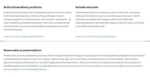
Airbnb does this...differently. The homepage features a wall of words about engineering, diversity and belonging, and EEOC compliance. Not only is this section painfully text heavy (I scrolled right past it twice) these things don’t exactly belong together. And what if I’m not an engineer? Is there no place for me at Airbnb?
Though this section as it appears here is a failure, it is definitely worth clicking through to the engineering and diversity and belonging pages. The former is a rich employer blog, which we love, and the latter is a page loaded with stats about the company’s demographic makeup and its affinity groups. They put so much time and energy into building these beautiful sections of the microsite, why don’t they get better teasers on the home page?
This one is a draw, but we’re concerned about you, Airbnb.
The employer blog
We can’t stress enough what a powerful asset an employer blog can be. When it’s updated regularly and features employees sharing their experiences in their own words, it can stoke enthusiasm both among candidates and within your organization.
VRBO/Expedia’s blog includes employee profiles and the occasional event announcements. In the top nav, there’s a link to their tech blog, which actually lives on Medium. Having two blog locations isn’t ideal, but it seems they’re directly competing with Airbnb here.
Airbnb’s employer blog also lives on Medium. It’s updated regularly and also features employee profiles as well as in-depth info and commentary about company projects, but it’s about only tech work at the company.
Again...what if I don’t work in tech?
I get it, Airbnb is ultimately a tech company, so this is going to be its principal focus, but it sends a pretty clear signal to the rest of the organization and to potential candidates.
And as someone who’s been a non-tech employee at a tech company, I always felt like a second-class citizen.
And the winner is…
We’re gonna give this one to Expedia/VRBO. Both microsites are well developed and full of information about the employee experience, but Airbnb’s site is really about the experience of only employees in tech roles at the company.
If I’m looking for a new employer, I want one I know will value me, regardless of my job title.
*For this article, we’re using https://lifeatexpediagroup.com/brands as the main landing page because this is the page users are routed to through VRBO’s website.
Emily McCrary-Ruiz-Esparza writes about workplace culture, DEI, and hiring. Her work has appeared in Fast Company, From Day One, and InHerSight, among others.
ABOUT UNCUBED STUDIOS
Launched in 2016, Uncubed Studios is a full-service creative agency with a client list representing the most influential employers on earth along with the high growth tech companies.
The team that brings the work of Uncubed Studios to life is made up of award-winning experts in cinematography, journalism, production, recruitment, employee engagement, employer branding and more.
Uncubed Studios is part of the Uncubed Group, which also includes Mediabistro, the leading talent & professional community in the media sector, and Finalist, the curated sourcing platform for early professional tech talent.
Interested in speaking with Uncubed Studios for a media opportunity? Contact studios@uncubed.com


